Visualizations in Databricks

With data becoming a pillar stone of a company’s growth strategy, the market for visualization tools is growing rapidly, with a projected compound annual growth rate (CAGR) of 10.07% between 2023 and 2028.
The primary driver of these trends is the need for data-driven decision-making, which involves understanding complex data patterns and extracting actionable insights to improve operational efficiency.
PowerBI and Tableau are traditional tools with interactive workspaces for creating intuitive dashboards and exploring large datasets. However, other platforms are emerging to address the ever-changing nature of the modern data ecosystem.
In this article, we will discuss the visualizations offered by Databricks - a modern enterprise-scale platform for building data, analytics, and artificial intelligence (AI) solutions.
Databricks
Databricks is an end-to-end data management and model development solution built on Apache Spark. It lets you create and deploy the latest generative AI (Gen AI) and large language models (LLMs).
The platform uses a proprietary Mosaic AI framework to streamline the model development process. It provides tools to fine-tune LLMs seamlessly through enterprise data and offers a unified service for experimentation through foundation models.
In addition, it features Databricks SQL, a state-of-the-art lakehouse for cost-effective data storage and retrieval. It lets you centrally store all your data assets in an open format, Delta Lake, for effective governance and discoverability.
Further, Databricks SQL has built-in support for data visualization, which lets you extract insights from datasets directly from query results in the SQL editor.
Users also benefit from the visualization tools featured in Databricks Notebooks, which help you build interactive charts by using the Plotly library in Python.
Through these visualizations, Databricks offers robust data analysis for monitoring data assets critical to your AI models. So, let’s discuss in more detail the types of chart visualizations, graphs, diagrams, and maps available on Databricks to help you choose the most suitable visualization type for your use case.
Visualizations in Databricks
As mentioned earlier, Databricks provides visualizations through Databricks SQL and Databricks Notebooks. The platform lets you run multiple SQL queries to perform relevant aggregations and apply filters to visualize datasets according to your needs.
Databricks also allows you to configure settings related to the X and Y axes, legends, missing values, colors, and labels. Users can also download visualizations in PNG format for documentation purposes.
The following sections provide an overview of the various visualization types available in these two frameworks, helping you select the most suitable option for your project.
Bar Chart
Bar charts are helpful when you want to compare the frequency of occurrence of different categories in your dataset. For instance, you can draw a bar chart to compare the frequency of various age groups, genders, ethnicities, etc.
Additionally, bar charts can be used to view the sum of the prices of all orders placed in a particular month and group them by priority.
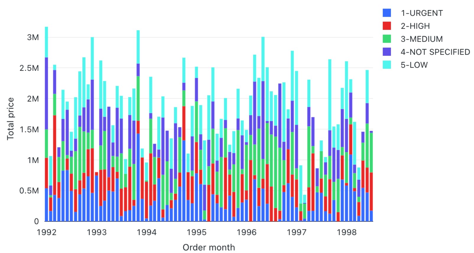
The result will show the months on the X-axis and the sum of all the orders categorized by priority on the Y-axis.
Line
Line charts connect different data points through straight lines. They are helpful when users want to analyze trends over some time. The charts usually show time on the X-axis and some metrics whose trajectory you want to explore on the Y-axis.
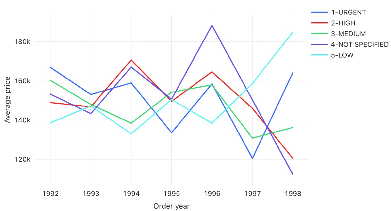
For instance, you can view changes in the average price of orders over the years grouped by priority. The trends can help you predict the most likely future values, which can help you with financial projections and budget planning.
Pie Chart
Pie charts display the proportion of different categories in a dataset. They divide a circle into multiple segments, each showing the proportion of a particular category, with the segment size proportional to the category’s percentage of the total.
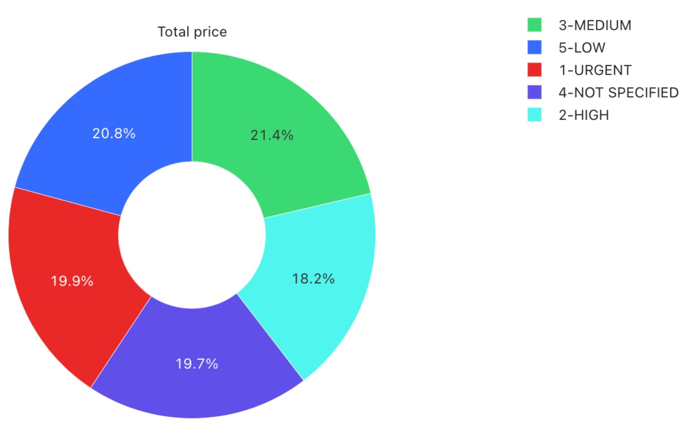
For instance, you can visualize the proportion of orders for each priority.
The visualization is helpful when you want a quick overview of data distribution across different segments. It can help you analyze demographic patterns, market share of other products, budget allocation, etc.
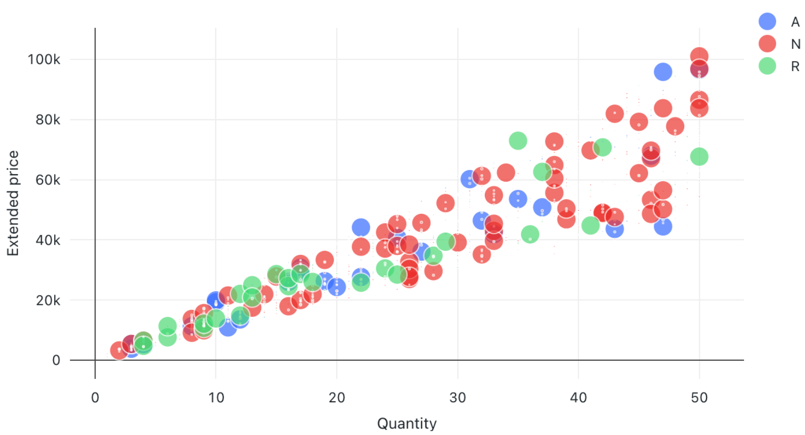
Scatter Plot
A scatter plot displays each data point as a dot representing a relationship between two variables. Users can also control the color of each dot to reflect the relationship across different groups.
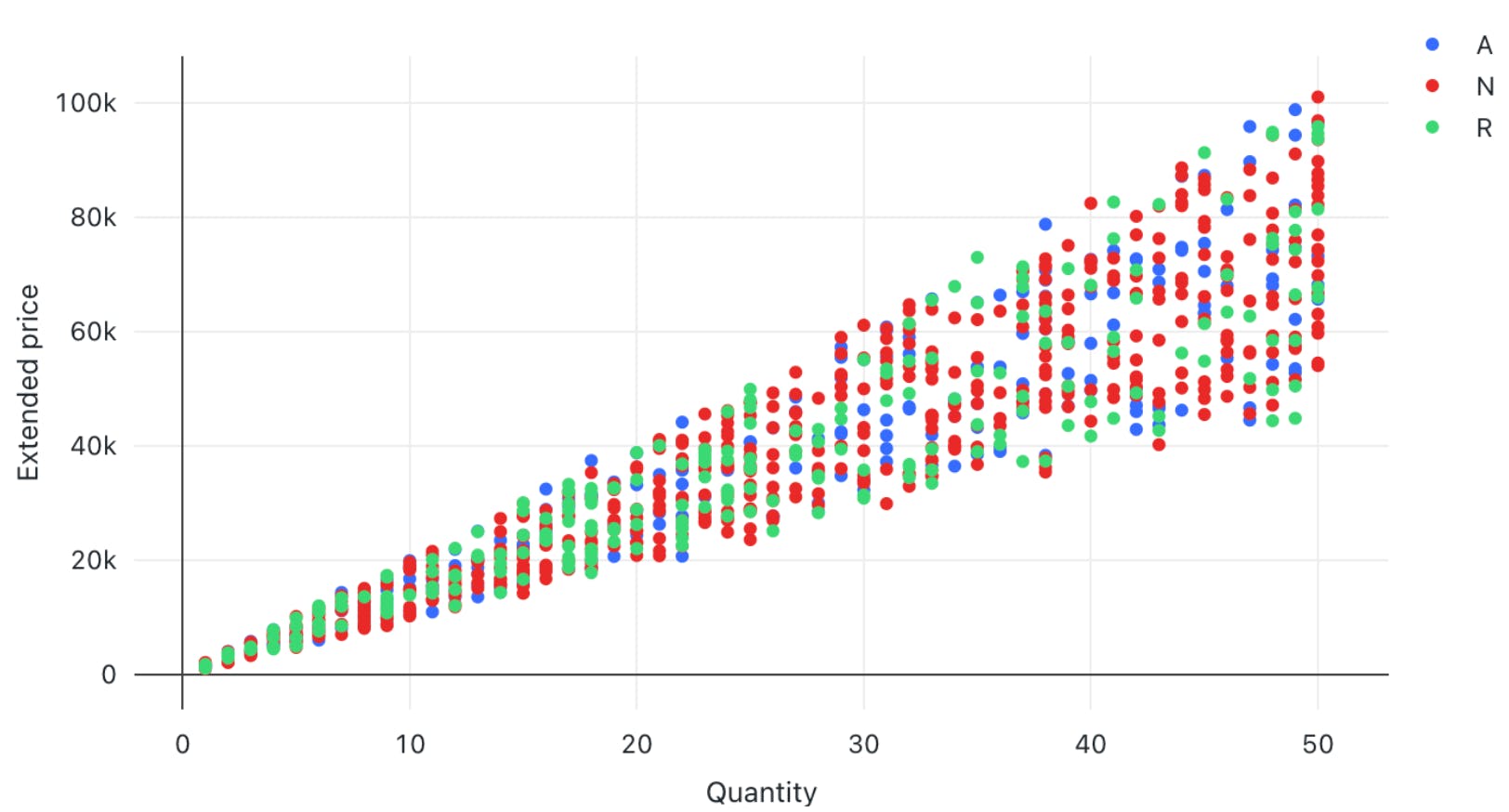
For instance, you can plot the relationship between quantity and price for different color-coded item categories.
The visualization helps in understanding the correlation between two variables. However, users must interpret the relationship cautiously, as correlation does not always imply causation. Deeper statistical analysis is necessary to uncover causal factors. If you're seeking more robust and specialized visualization tools, exploring Tableau alternatives can offer additional functionalities that might better suit your data analysis and reporting needs.
Area Charts
Area charts combine line and bar charts by displaying lines and filling the area underneath with colors representing particular categories. They show how the contribution of a specific category changes relative to others over time.
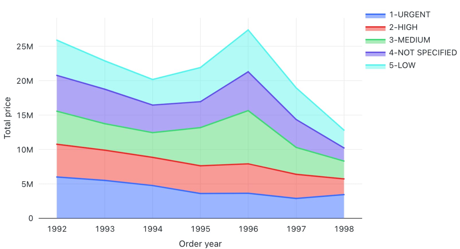
For instance, you can visualize which type of order priority contributed the most to revenue by plotting the total price of different order priorities across time.
The visualization helps you analyze the composition of a specific metric and how that composition varies over time. It is particularly beneficial in analyzing sales growth patterns for different products, as you can see which product contributed the most to growth across time.
Box Chart
Box charts concisely represent data distributions of numerical values for different categories. They show the distribution’s median, skewness, interquartile, and value ranges.
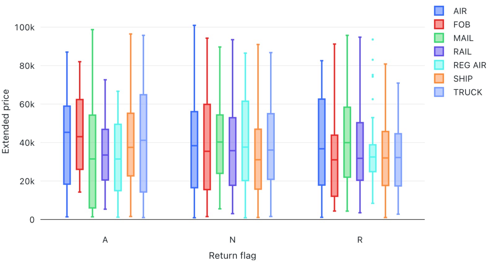
For instance, the box can display the median price value through a line inside the box and the interquartile range through the top and bottom box enclosures. The extended lines represent minimum and maximum price values to compute the price range.
The chart helps determine the differences in distribution across multiple categories and lets you detect outliers. You can also see the variability in values across different categories and examine which category was the most stable.
Bubble Chart
Bubble charts enhance scatter plots by allowing you to visualize the relationship of three variables in a two-dimensional grid.
The bubble position represents how the variable on the X-axis relates to the variable on the Y-axis. The bubble size represents the magnitude of a third variable, showing how it changes as the values of the first two variables change.
The visualization is helpful for multi-dimensional datasets and provides greater insight when analyzing demographic data. However, like scatter plots, users must not mistake correlation for causation.
Combo Chart
Combo charts combine line and bar charts to represent key trends in continuous and categorical variables. The categorical variable is on the X-axis, while the continuous variable is on the Y-axis.
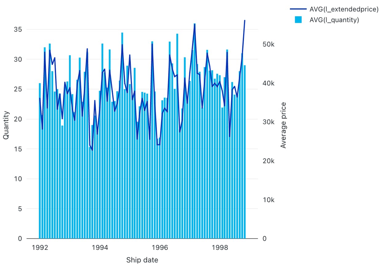
For instance, you can analyze how the average price varies with the average quantity according to shipping date.
The visualization helps summarize complex information involving relationships between three variables on a two-dimensional graph. However, unambiguous interpretation requires careful configuration of labels, colors, and legends.
Heatmap Chart
Heatmap charts represent data in a matrix format, with each cell having a different color according to the numerical value of a specific variable. The colors change according to the value intensity, with lower values typically having darker and higher values having lighter colors.
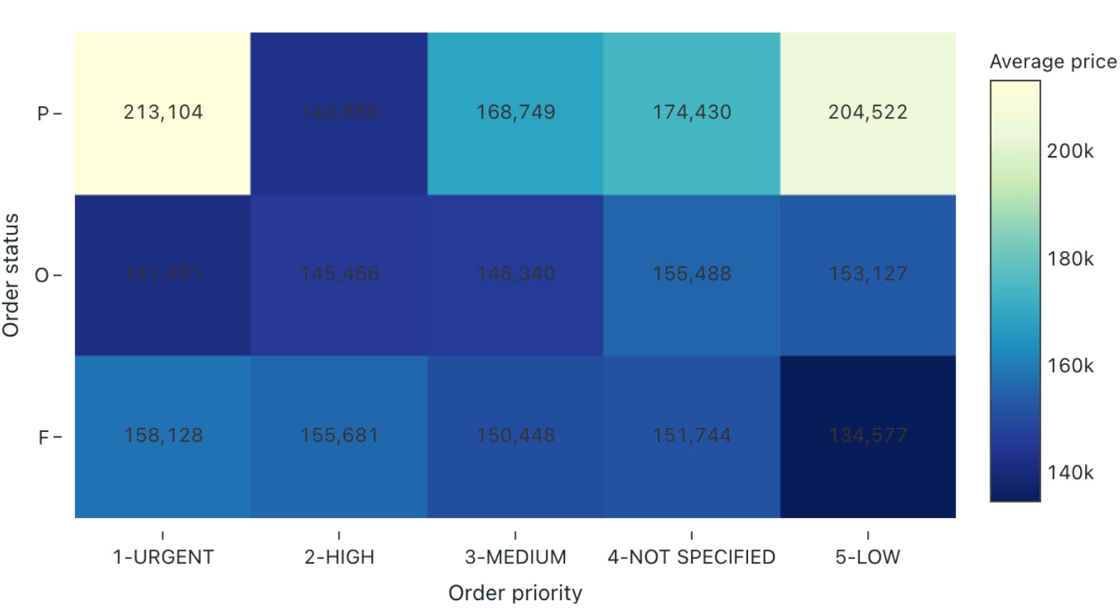
For instance, you can visualize how the average price varies according to order priority and order status. Heatmaps are particularly useful in analyzing correlation intensity between two variables. They also help detect outliers by representing unusual values through separate colors. However, interpreting the chart requires proper scaling to ensure colors do not misrepresent intensities.
Histogram
Histograms display the frequency of particular value ranges to show data distribution patterns. The X-axis contains the value ranges organized as bins, and the Y-axis shows the frequency of each bin.
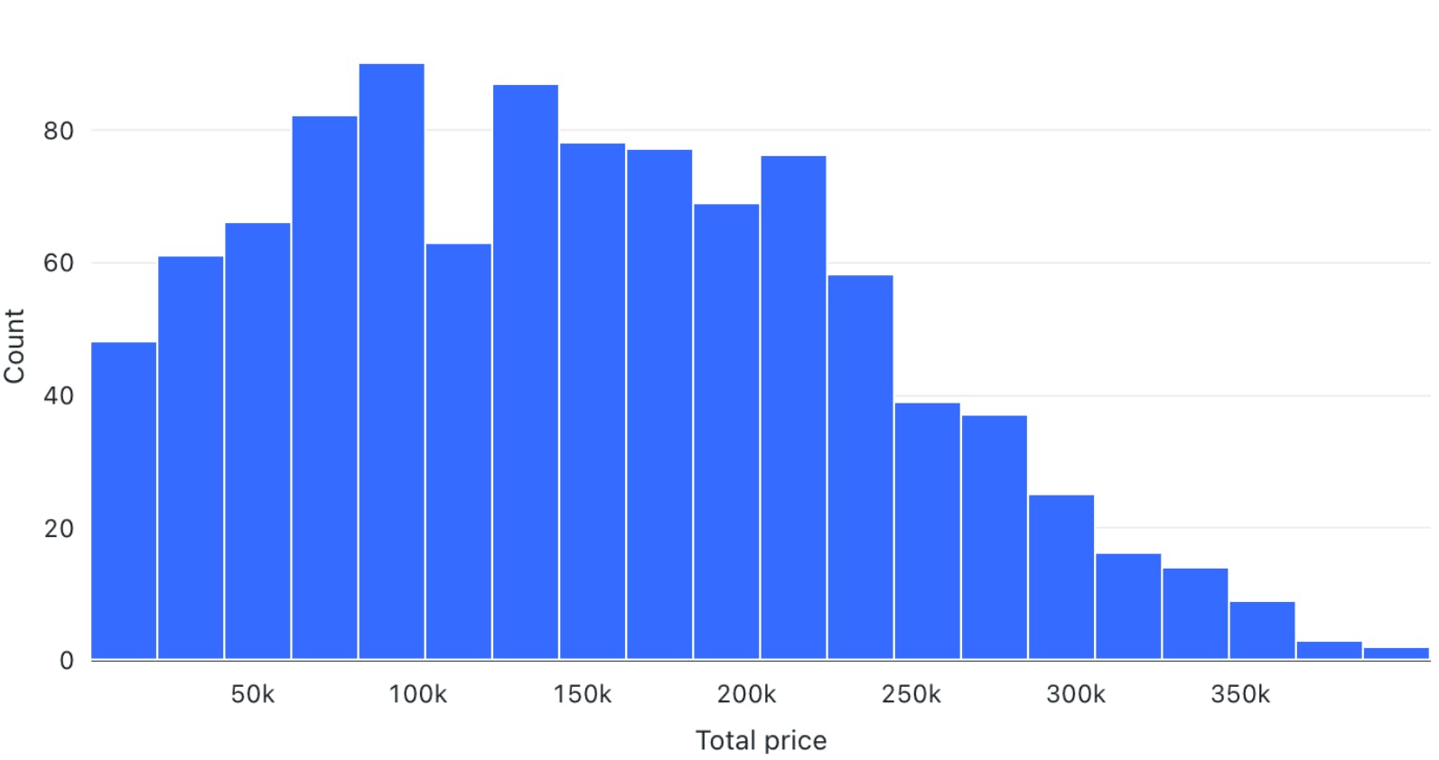
For instance, you can visualize the frequency of different price ranges to understand price distribution for your orders.
The visualization lets you analyze data spread and skewness. It is beneficial in deeper statistical analysis, where you want to derive probabilities and build predictive models.
Pivot Tables
Pivot tables can help you manipulate tabular displays through drag-and-drop options by changing aggregation records. The option is an alternative to SQL filters for viewing aggregate values according to different conditions.
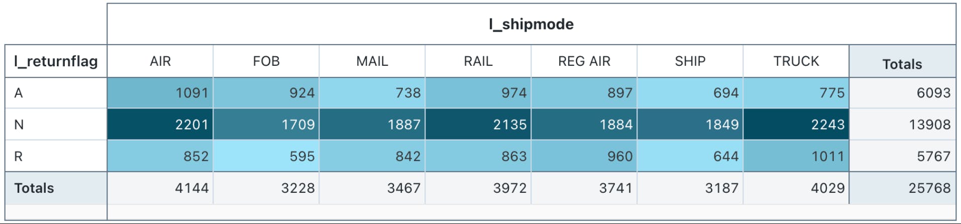
For instance, you can group total orders by shipping mode and order category.
The visualization helps prepare ad-hoc reports and provides important summary information for decision-making. Interactive pivot tables also let users try different arrangements to reveal new insights.
Choropleth Map Visualization
Choropleth map visualization represents color-coded aggregations categorized according to different geographic locations. Regions with higher value intensities have darker colors, while those with lower intensities have lighter shades.
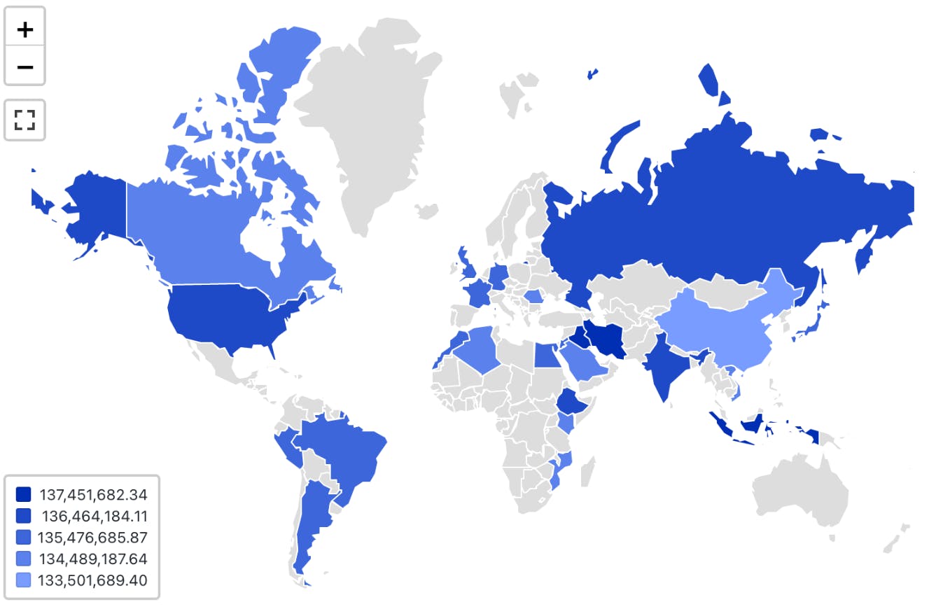
For instance, you can visualize the total revenue coming from different countries. This visualization helps determine global presence and highlight disparities across borders. The insights will allow you to develop marketing strategies tailored to regional tastes and behavior.
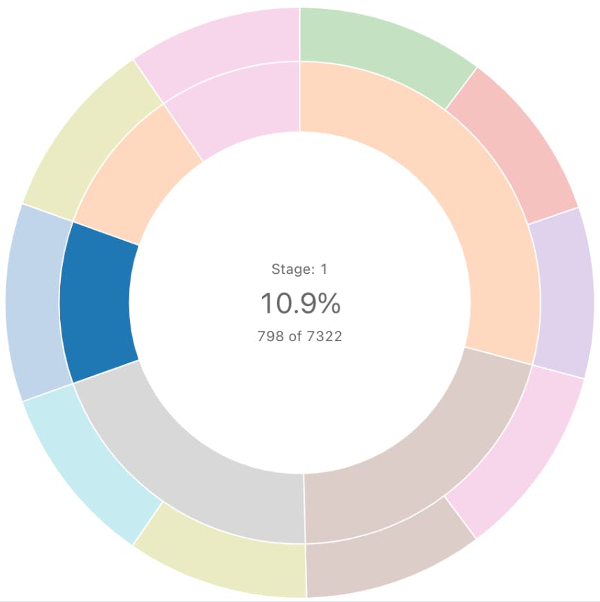
Funnel Visualization
Funnel visualization depicts data aggregations categorized according to specific steps in a pipeline. It represents each step from top to bottom with a bar and the associated value as a label overlay on each bar.
It also displays cumulative percentage values showing the proportion of the aggregated value resulting from each stage.
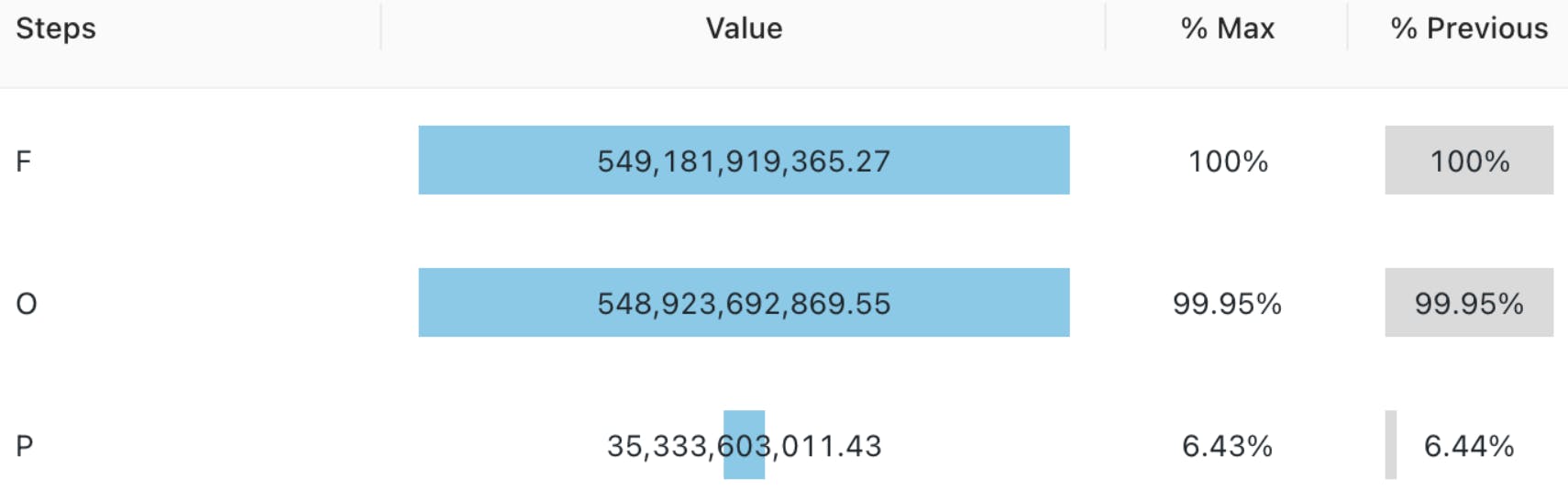
For instance, you can determine the incoming revenue streams at each stage of the ordering process.
This visualization is particularly helpful in analyzing marketing pipelines for e-commerce sites. The tool shows the proportion of customers who view a product ad, click on it, add it to the cart, and proceed to check out.
Cohort Analysis
Cohort analysis offers an intuitive visualization to track the trajectory of a particular metric across different categories or cohorts.
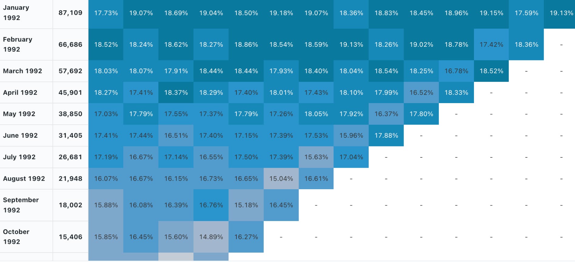
For instance, you can analyze the number of active users on an app that signed up in different months of the year. The rows will depict the months, and the columns will represent the proportion of active users in a particular cohort as they move along each month.
The visualization helps in retention analysis as you can determine the proportion of retained customers across the user lifecycle.
Counter Display
Databricks allows you to configure a counter display that explicitly shows how the current value of a particular metric compares with the metric’s target value.
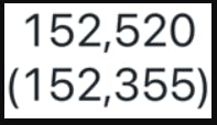
For instance, you can check how the average total revenue compares against the target value. In Databricks, the first row represents the current value, and the second is the target.
The visualization helps give a quick snapshot of trending performance and allows you to quantify goals for better strategizing.
Sankey Diagrams
Sankey diagrams show how data flows between different entities or categories. It represents flows through connected links representing the direction, with entities displayed as nodes on either side of a two-dimensional grid.
The width of the connected links represents the magnitude of a particular value flowing from one entity to the other.
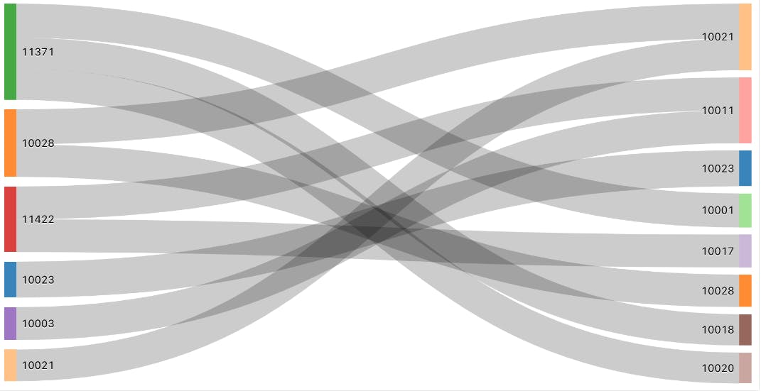
For instance, you can analyze traffic flows from one location to the other.
Sankey diagrams can help data engineering teams analyze data flows from different platforms or servers. The analysis can help identify bottlenecks, redundancies, and resource constraints for optimization planning.
Sunburst Sequence
The sunburst sequence visualizes hierarchical data through concentric circles. Each circle represents a level in the hierarchy and has multiple segments.
Each segment represents the proportion of data in the hierarchy. Furthermore, it color codes segments to distinguish between categories within a particular hierarchy.
For instance, you can visualize the population of different world regions through a sunburst sequence. The innermost circle represents a continent, the middle one shows a particular region, and the outermost circle displays the country within that region.
The visualization helps data science teams analyze relationships between nested data structures. The information will allow you to define clear data labels needed for model training.
Table
A table represents data in a structured format with rows and columns. Databricks offers additional functionality to hide, reformat, and reorder data.
Tables help summarize information in structured datasets. You can use them for further analysis through SQL queries.
Word Cloud
Word cloud visualizations display words in different sizes according to their frequency in textual data.
For instance, you can analyze customer comments or feedback and determine overall sentiment based on the highest-occurring words.
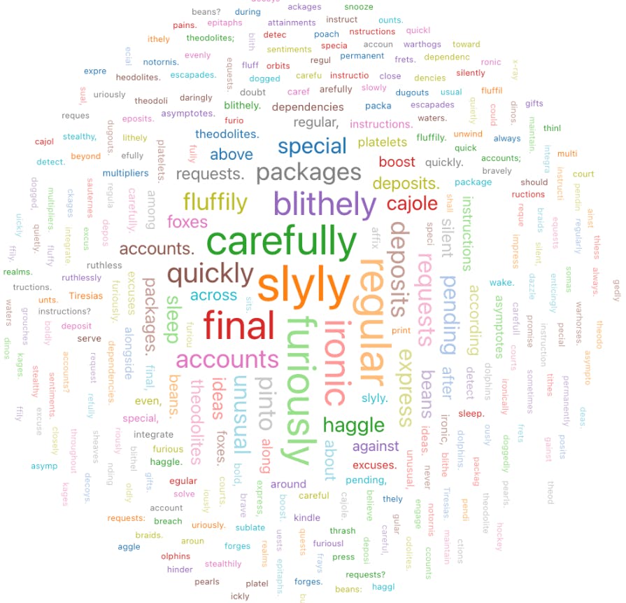
While word clouds help identify key themes in unstructured textual datasets, they can suffer from oversimplification. Users must use word clouds only as a quick overview and augment textual analysis with advanced natural language processing techniques.
Visualizations in Databricks: Key Takeaways
With an ever-increasing data volume and variety, visualization is becoming critical for quickly communicating data-based insights in a simplified manner. Databricks is a powerful tool with robust visualization types for analyzing complex datasets.
Below are a few key points to remember regarding visualization in Databricks.
- Databricks SQL and Databricks Notebooks: Databricks offers advanced visualizations through Databricks SQL and Databricks Notebooks as a built-in functionality.
- Visualization configurations: Users can configure multiple visualization settings to produce charts, graphs, maps, and diagrams per their requirements.
- Visualization types: Databricks offers multiple visualizations, including bar charts, line graphs, pie charts, scatter plots, area graphs, box plots, bubble charts, combo charts, heatmaps, histograms, pivot tables, choropleth maps, funnels, cohort tables, counter display, Sankey diagrams, sunburst sequences, tables, and word clouds.
Frequently asked questions
Databricks is a data and AI model development solution that offers multiple visualization types for analyzing datasets.
Warehousing in Databricks comes through Databricks SQL - a server-less storage and data manipulation framework built on a lakehouse architecture.
Databricks, PowerBI, and Tableau are popular visualization tools.
Users must avoid misinterpreting relationships and mistaking correlation for causation. Another common mistake is to over-clutter visual charts with irrelevant information.
You must consider your audience's needs, the context, the amount, and the nature of the information you wish to present.
Encord offers features that streamline annotation workflows, including easy tracking of annotation progress, collaboration tools for teams, and the ability to visualize data annotations. This ensures that researchers can efficiently manage their projects without the need for dedicated personnel.
The workflow graph in Encord's platform illustrates the series of steps involved in enriching or correcting data and labels within the system. It provides a visual representation of the data flow, enabling users to understand how curation and annotation processes are structured and executed.
Encord offers advanced visualization features, including dimensionality reduction techniques that help users visualize their datasets effectively. This allows for easy identification of edge cases and noise within the data, enhancing the overall quality of model training.
The embeddings plot in Encord provides a high-level summary of data, allowing users to visualize clusters and patterns. This feature aids in identifying edge cases and understanding the characteristics of different data segments, such as variations in brightness.
Yes, Encord allows users to visualize the annotation results and workflows. Users can see how data is loaded, the annotation process, and the results, providing a comprehensive understanding of the project and ensuring clarity throughout the process.
Encord offers robust visualization tools that allow users to explore their datasets easily. Users can sort and filter data by various metrics, such as brightness and color values, helping to analyze and understand the dataset at a granular level.
If visualization tools for labels are not readily accessible within the Encord platform, users should reach out to support for assistance or consider utilizing external tools to create custom visualizations based on their annotation data.
Encord offers customizable workflow management tools that help organize annotation tasks, assign roles, and define review stages. This structured approach enhances collaboration and ensures a streamlined annotation process.
Encord supports visualization of various data modalities, including image data, video data, and more. This versatility is particularly beneficial for teams needing to analyze comprehensive data sets for annotation.