Featured ArticleEncord Releases New Physical AI Suite with LiDAR Support
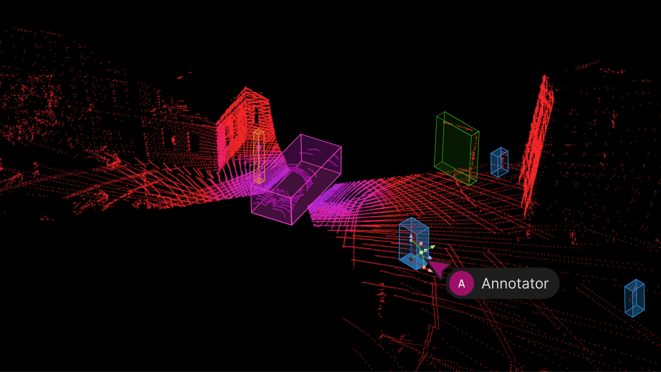
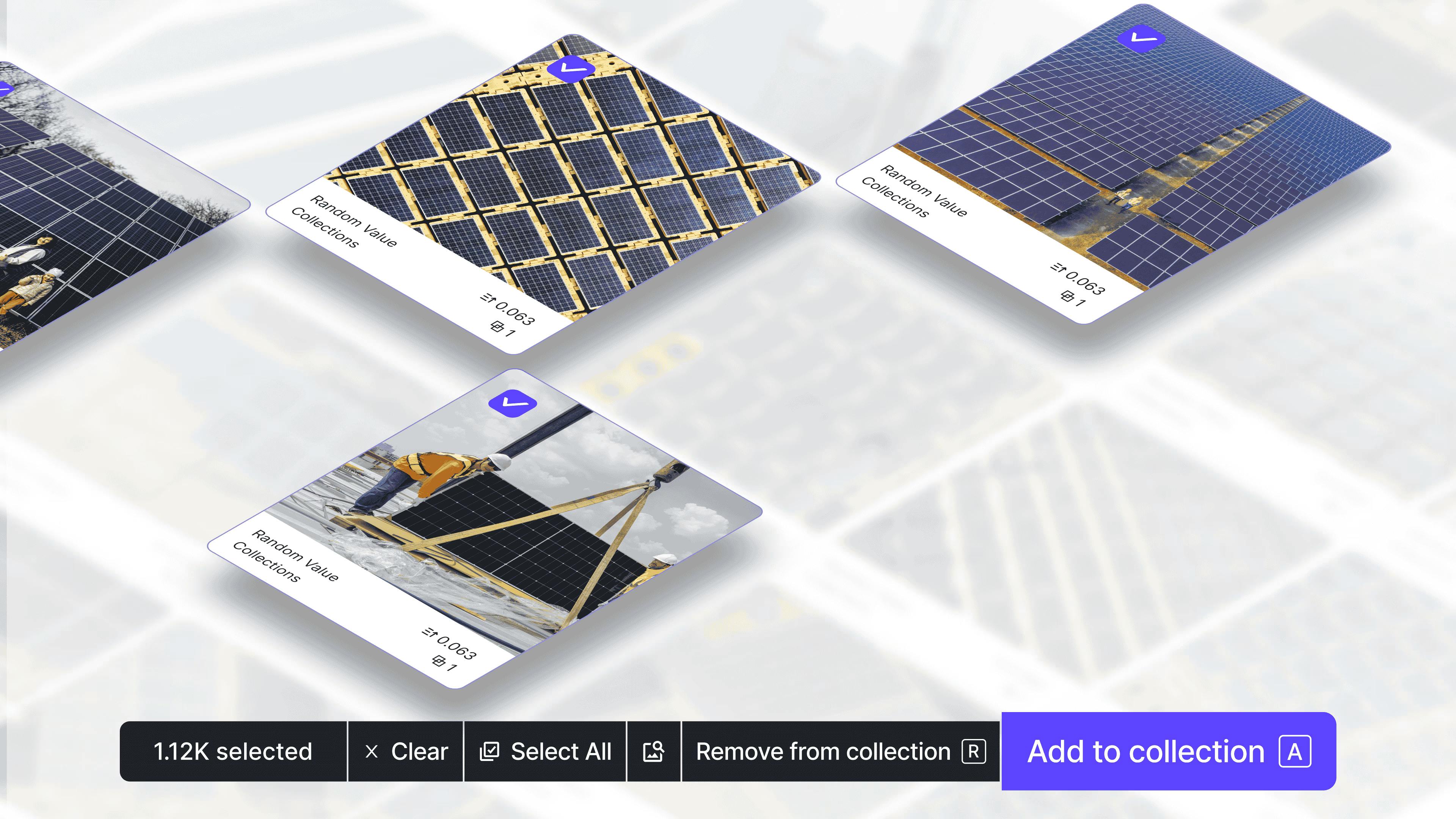
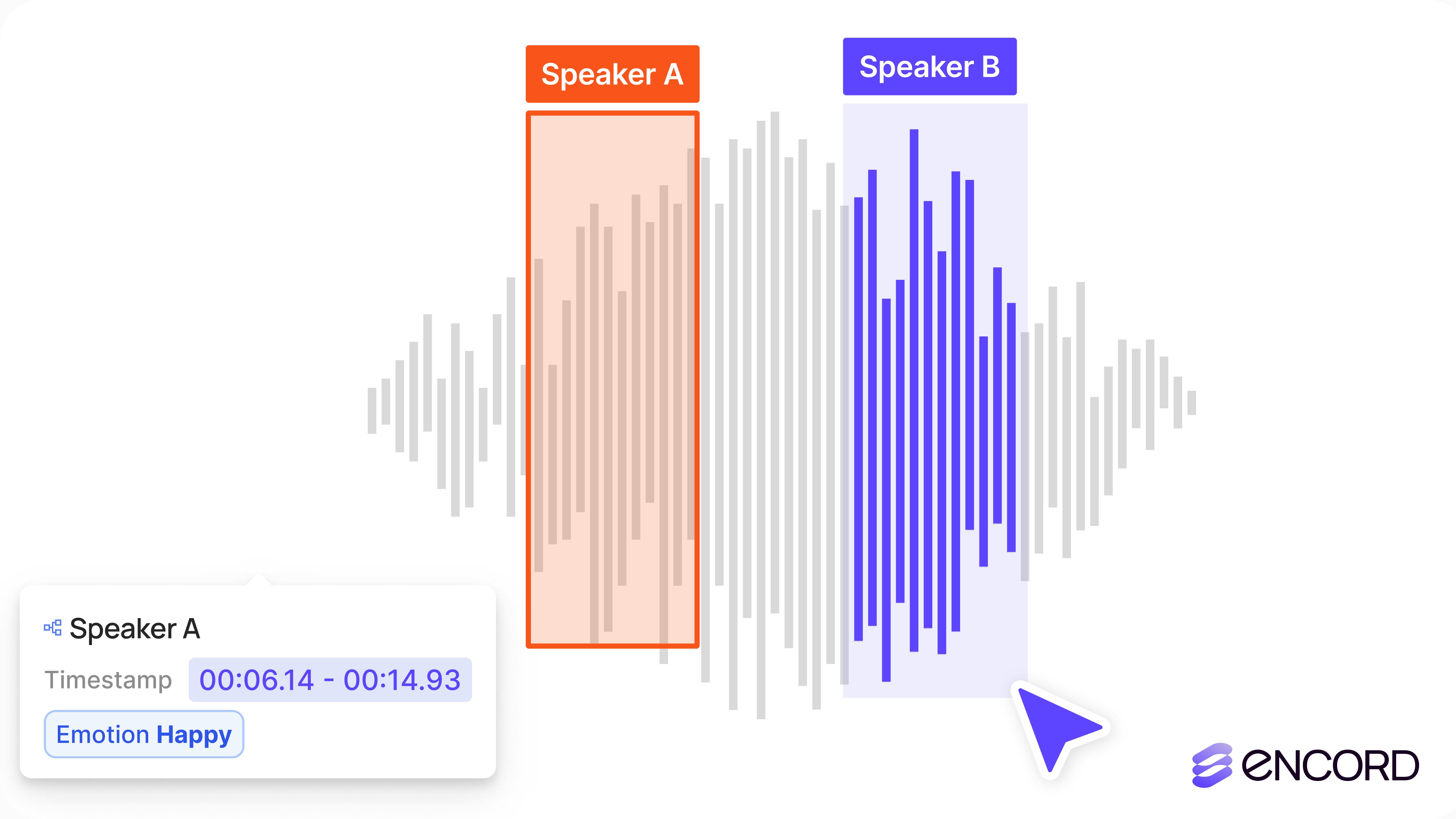
We’re excited to introduce support for 3D, LiDAR and point cloud data. With this latest release, we’ve created the first unified and scalable Physical AI suite, purpose-built for AI teams developing robotic perception, VLA, AV or ADAS systems. With Encord, you can now ingest and visualize raw sensor data (LiDAR, radar, camera, and more), annotate complex 3D and multi-sensor scenes, and identify edge-cases to improve perception systems in real-world conditions at scale. 3D data annotation with multi-sensor view in Encord Why We Built It Anyone building Physical AI systems knows it comes with its difficulties. Ingesting, organizing, searching, and visualizing massive volumes of raw data from various modalities and sensors brings challenges right from the start. Annotating data and evaluating models only compounds the problem. Encord's platform tackles these challenges by integrating critical capabilities into a single, cohesive environment. This enables development teams to accelerate the delivery of advanced autonomous capabilities with higher quality data and better insights, while also improving efficiency and reducing costs. Core Capabilities Scalable & Secure Data Ingestion: Teams can automatically and securely synchronize data from their cloud buckets straight into Encord. The platform seamlessly ingests and intelligently manages high-volume, continuous raw sensor data streams, including LiDAR point clouds, camera imagery, and diverse telemetry, as well as commonly supported industry file formats (such as MCAP). Intelligent Data Curation & Quality Control: The platform provides automated tools for initial data quality checks, cleansing, and intelligent organization. It helps teams identify critical edge cases and structure data for optimal model training, including addressing the 'long-tail' of unique scenarios that are crucial for robust autonomy. Teams can efficiently filter, batch, and select precise data segments for specific annotation and training needs. 3D data visualization and curation in Encord AI-Accelerated & Adaptable Data Labeling: The platform offers AI-assisted labeling capabilities, including automated object tracking and single-shot labeling across scenes, significantly reducing manual effort. It supports a wide array of annotation types and ensures consistent, high-precision labels across different sensor modalities and over time, even as annotation requirements evolve. Comprehensive AI Model Evaluation & Debugging: Gain deep insight into your AI model's performance and behavior. The platform provides sophisticated tools to evaluate model predictions against ground truth, pinpointing specific failure modes and identifying the exact data that led to unexpected outcomes. This capability dramatically shortens iteration cycles, allowing teams to quickly diagnose issues, refine models, and improve AI accuracy for fail-safe applications. Streamlined Workflow Management & Collaboration: Built for large-scale operations, the platform includes robust workflow management tools. Administrators can easily distribute tasks among annotators, track performance, assign QA reviews, and ensure compliance across projects. Its flexible design enables seamless integration with existing engineering tools and cloud infrastructure, optimizing operational efficiency and accelerating time-to-value. Encord offers a powerful, collaborative annotation environment tailored for Physical AI teams that need to streamline data labeling at scale. With built-in automation, real-time collaboration tools, and active learning integration, Encord enables faster iteration on perception models and more efficient dataset refinement, accelerating model development while ensuring high-quality, safety-critical outputs. Implementation Scenarios ADAS & Autonomous Vehicles: Teams building self-driving and advanced driver-assistance systems can use Encord to manage and curate massive, multi-format datasets collected across hundreds or thousands of multi-hour trips. The platform makes it easy to surface high-signal edge cases, refine annotations across 3D, video, and sensor data within complex driving scenes, and leverage automated tools like tracking and segmentation. With Encord, developers can accurately identify objects (pedestrians, obstacles, signs), validate model performance against ground truth in diverse conditions, and efficiently debug vehicle behavior. Robot Vision: Robotics teams can use Encord to build intelligent robots with advanced visual perception, enabling autonomous navigation, object detection, and manipulation in complex environments. The platform streamlines management and curation of massive, multi-sensor datasets (including 3D LiDAR, RGB-D imagery, and sensor fusion within 3D scenes), making it easy to surface edge cases and refine annotations. This helps teams improve how robots perceive and interact with their surroundings, accurately identify objects, and operate reliably in diverse, real-world conditions. Drones: Drone teams use Encord to manage and curate vast multi-sensor datasets — including 3D LiDAR point clouds (LAS), RGB, thermal, and multispectral imagery. The platform streamlines the identification of edge cases and efficient annotation across long aerial sequences, enabling robust object detection, tracking, and autonomous navigation in diverse environments and weather conditions. With Encord, teams can build and validate advanced drone applications for infrastructure inspection, precision agriculture, construction, and environmental monitoring, all while collaborating at scale and ensuring reliable performance Vision Language Action (VLA): With Encord, teams can connect physical objects to language descriptions, enabling the development of foundation models that interpret and act on complex human commands. This capability is critical for next-generation human-robot interaction, where understanding nuanced instructions is essential. For more information on Encord's Physical AI suite, click here.
Product
Read article 


![[Live Event Recap] Introducing the Encord Agents Catalog: Deploy AI Agents in Minutes](https://images.prismic.io/encord/abqfybbci2UF6L4f_MarchmasterclassResizedforLI.png?auto=format%2Ccompress&fit=max)
![Best Data Annotation Tools for Physical AI: Ranked & Compared [2026]](https://images.prismic.io/encord/aCcN4ydWJ-7kSNZM_Screenshot2025-05-16at11.03.44.png?auto=format%2Ccompress&fit=max)
![Top 8 Video Annotation Tools for Computer Vision [Updated 2026]](https://images.prismic.io/encord/6a1e49ec-5e0f-42ae-b930-9289b01a1471_Best+Video+Annotation+tools.png?auto=compress%2Cformat&fit=max)
![18 Best Image Annotation Tools for Computer Vision [Updated 2026]](https://images.prismic.io/encord/e81d3bc1-bc56-4639-bcf9-f1d6a9c1d5f8_best+image+annotation+tools+banner.png?auto=compress%2Cformat&fit=max)

![[Masterclass Recap] Building Robust 3D Data Pipelines: From Manual Cuboids to Scalable Workflows](https://images.prismic.io/encord/aZg9jcFoBIGEgl2o_FebmasterclassResizedforLIeventcopy.png?auto=format%2Ccompress&fit=max)
![12 Best Data Labeling Companies [2026]](https://images.prismic.io/encord/Z021zZbqstJ978t7_dataannotationcompanies.avif?auto=format%2Ccompress&fit=max)